QGauge Properties
| Field | Type | R/W | Default |
| Align | INTEGER | RW | alNone |
| Align determines how the control aligns within its parent control. | |||
| BackColor | INTEGER | RW | clWhite |
| BackColor specifies the background color of the component. | |||
| BorderStyle | INTEGER | RW | bsSingle |
| '-- Border Styles CONST bsNone = 0 '-- No visible border line, Not resizeable CONST bsSingle = 1 '-- Single-line border, Not resizeable CONST bsSizeable = 2 '-- Standard resizeable border CONST bsDialog = 3 '-- Dialog, not resizeable CONST bsToolWindow = 4 '-- like bsSingle but with a smaller caption CONST bsSizeToolWin = 5 '-- like bsSizeable with a smaller caption | |||
| Color | INTEGER | RW | |
| Cursor | INTEGER | RW | crDefault |
| Enabled | INTEGER | RW | True |
| Font | QFONT | W | |
| ForeColor | INTEGER | RW | |
| ForeColor specifies the color of the progress meter. | |||
| Height | INTEGER | RW | |
| Hint | STRING | RW | |
| Kind | INTEGER CONST gkText = 0 CONST gkHorizontalBar = 1 CONST gkVerticalBar = 2 CONST gkPie = 3 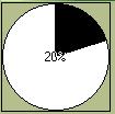 CONST gkNeedle = 4  | RW | gkHorizontalBar |
| Left | INTEGER | RW | |
| Max | INTEGER | RW | 100 |
| Min | INTEGER | RW | 0 |
| Parent | QFORM/QPANEL/QTABCONTROL | W | |
| Position | INTEGER | RW | 0 |
| ShowHint | INTEGER | RW | False |
| ShowText | INTEGER | RW | True |
| ShowText determines whether the progress text (as a percent) should be displayed. | |||
| Top | INTEGER | RW | |
| Visible | INTEGER | RW | True |
| Width | INTEGER | RW | |
QGauge Examples
$INCLUDE "RAPIDQ.INC"

CREATE Form AS QForm
  Center
  CREATE Gauge AS QGauge
    Position = 20
    Kind = gkPie
  END CREATE
  ShowModal
END CREATE
| Prev Component | Contents | Next Component |